Product Page - Customization Guide
Learn how to customize the appearance, text, and placement of your wishlist buttons to perfectly match your store's branding. Our real-time preview panel helps you see changes instantly.
1. Page Selection Tabs
At the top of the customization screen, you can choose which part of your store you want to configure:
- Product Page: Customize the wishlist button that appears on individual product details pages.
- Wishlist Page: Configure the dedicated page where customers view all their saved items.
- Header Customize: Adjust the wishlist shortcut icon/badge in your website's main header navigation.
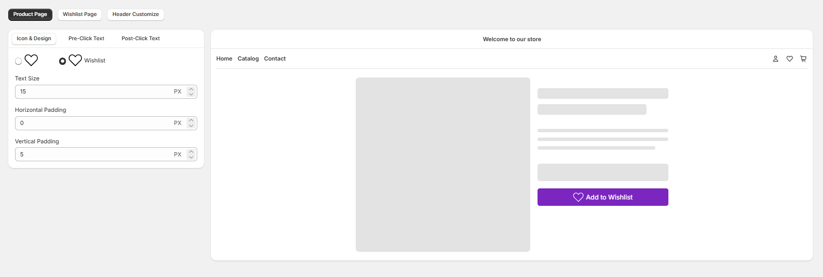
2. Button Design & Settings (Left Panel)
When customizing the Product Page, you have three dedicated sub-tabs to control the button's layout and content:
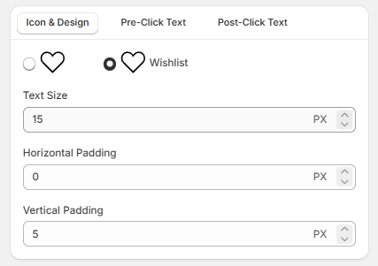
A. Icon & Design Tab
- Icon Style Selection: Choose between a simple heart icon layout or a heart icon accompanied by text (e.g., "Wishlist").
- Horizontal Padding: Adjust the left and right spacing inside the button (measured in pixels/PX) to change its width.
- Vertical Padding: Adjust the top and bottom spacing inside the button (measured in pixels/PX) to change its height.
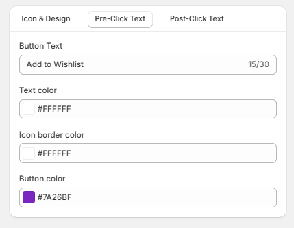
B. Pre-Click Text Tab
This tab lets you configure how the button looks before a customer clicks on it to add a product to their wishlist.
- Button Text: Customize the initial call-to-action message. It supports a maximum character limit of 30 characters.
- Text color: Choose the color of the text using a hex code picker
- Icon border color: Set the border stroke color of the heart shape icon before selection.
- Button color: Choose the background fill color of the main CTA button.
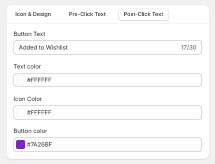
C. Post-Click Text Tab
This tab handles the visual transition after a user successfully clicks the button and adds the product to their custom list.
- Button Text: Change the text to confirm the action, giving instant feedback to your shoppers. It also has a 30-character limit.
- Text color: Choose the text color for the success state block.
- Icon Color: Set the solid fill color of the heart icon once it becomes active.
- Button color: Choose the background fill color of the active success state button to make it look distinct from the initial state.